
As you may have noticed, I’ve been on a bit of a blog hiatus the past several months. As well all know, life can get busy and sometimes that means stepping away for a little. With all that said, I am back! I’ll be posting here and there, but just wanted to check in and let ya’ll know I didn’t disappear into oblivion.
In other news, one of my very best friends got engaged a couple weeks back and asked me to be her maid of honor! For the past several years my life has been all about weddings, but I haven’t had the chance to take part in one, so I am incredibly honored and excited! She and I will be on a planning frenzy until her wedding in July, so I’m sure I’ll be making posts as the process goes along.
See you back here soon, friends! I’ve missed you:)

Happy third birthday to this blog!!!
Three years ago today I started this blog, and I honestly can’t believe everything that has come from it. I am grateful for all the awesome readers, the wonderful people I’ve had a chance to work with, and the beautiful friends I’ve made. Also, a special thanks to my endlessly supportive husband who pushed me to start The Loveliest Day in the first place!
Here’s to three more years:)
Photo via Geronimo

So, it’s been awhile since I talked about our first remodeling project in the new house in this post, but I’ve had a lot of people ask me for an update, so here it is! I will start off by saying, I know these photos aren’t on par with the gorgeous images I usually feature on this blog by great photographers, but alas, I am a terrible photographer and snapped all of these on my iPhone.
Here is a little collage of some photos I used as inspiration going into the project…
Photos via DecorPad
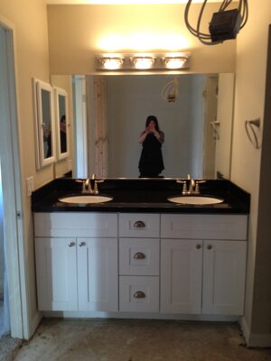
And here is what we started with, well part of it at least. I wish I had taken better before pictures, but I didn’t, so I will just try to describe what the space looked like before…
This is the only photo I have from before, a partial view of the master bath from the MLS listing photos. When we bought our house, the master bedroom was a fair size, but the bathroom was itty bitty and it just had a standard reach-in closet with sliding doors. That wasn’t going to cut it for us, because we really wanted to have a master suite that was spacious, relaxing, and a little bit luxe. To start, we took the space that housed the existing reach-in closet, as well as a linen closet in the hallway, and added that space to the bathroom. This allowed us to make the shower quite a bit larger and also add a makeup vanity. I REALLLLLLLLY wanted to put a tub in as well, but even with the newly improved space, it just wasn’t large enough.
Here is a shot after they had ripped the old tile flooring out, and it includes the horrible light fixture I couldn’t wait to get rid of. Also a photo of the newly framed shower stall. The toilet was in its own little area, but for some added privacy, we decided to add a pocket door. You can see the framing for that to the left of the shower.
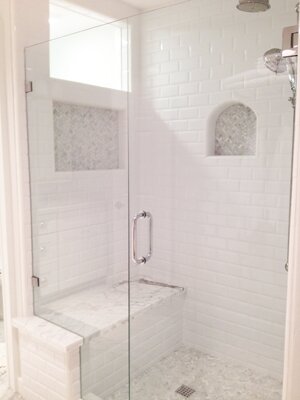
Here is an “in-progress” photo of the shower being tiled. We chose white beveled subway tiles for the walls, herringbone carrara tiles for the shower floor and the back of the niches. That unfinished seat you see was topped with a piece of a carrara slab we chose. The rest of the slab was used on the counter tops which you will see a bit later.
Now, to address the closet. Since we turned our existing closet into part of the new bathroom, we needed a new closet. Luckily there is a seriously gigantic bonus room next to the master (seriously, you could have fit 3 small bedrooms into it), so we broke through the wall and turned part of that bonus room into a new walk in closet for the master. Here is the new closet all framed out. I love that we were able to include a window in it!
Now to the finished bathroom + closet…
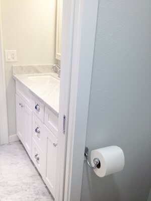
The sink vanity + closed pocket door.

Since there is only one small window in the bathroom and we wanted to let maximum light in, we had a “window” put towards the top of the shower stall. They made a frame around it on the outer wall that matched the look of the door frames we used throughout the master suite.
View from inside the pocket door, looking out + view outside the open pocket door, looking in.
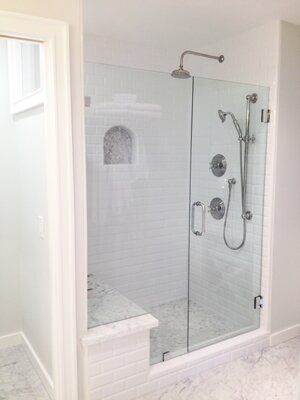
The view of the shower as you walk in the bathroom door. I really wanted to put a little linen cabinet into the bathroom, but we didn’t have enough space, so we opted for this train rack style towel storage. I love it!
Another view of the shower + a close up of the shower bench. The top of the bench came from my absolute favorite part of the carrara slab we chose. I looked at a ton in the stone yards before finally choosing this one. The dramatic veining is what won me over.
Now, to the closet…
Here is the sliding barn door we had installed. This is before the handle hardware was added. This has to be one of my favorite parts of the renovation!
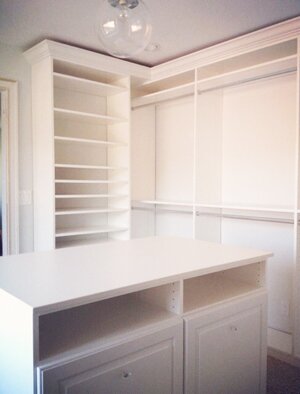
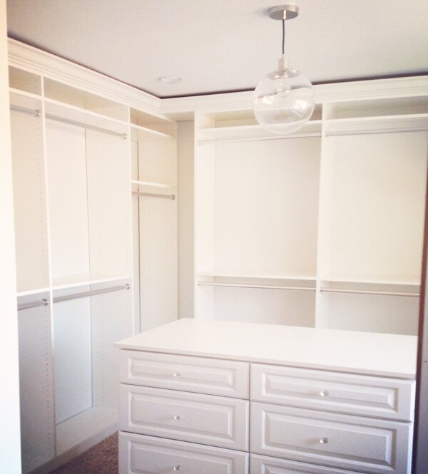
The sliding barn door with handle hardware + one view of the customized closet organizer, complete with pull out hampers. Those hampers had me over the moon!
And another view of the closet organizer. I chose to change the standard hardware they offered out for some little crystal knobs I bought. I’m so glad I did!
There is also another view of the closet which includes the window, shoe storage and two tall linen cabinets- but somehow I didn’t take a picture from that angle. I’ll have to share that later:)
Currently we are working on re-doing the staircase, adding in a pantry under the new stairs, and FINALLY painting the main area of the house. I will do another post with that project once it’s finished.
Hope you enjoyed this (despite my bad photos, haha)!

You’re probably wondering where the heck I’ve been! Well, it’s one of those times where life got so crazy that there was barely time for breathing and sleeping, let alone anything else. I mentioned it before, but we recently bought our first home!
Well, we finally moved in! My husband is also in the process of moving his screen printing business into a giant new building (SO proud/excited!!!), so with all of that, I’m sure you can imagine what my days were like- Packing, packing, cleaning, packing, packing, breaking down into irrational tears, and more packing.
We are also doing some remodeling. The master bath got completely gutted and was expanded into the existing master bedroom closet. We built a new walk in closet which takes up a portion of the huge bonus room which is next to the master. We wanted to have all that done before we moved in…but that didn’t happen. Managing a remodel has been a day-to-day learning process. It’s full of frustration, things going wrong and delays, but it’s also super exciting to see it all come together!
Above are some of the inspiration photos I used for our new bathroom/closet. If you follow me on Instagram, you’ve probably seen a few progress pictures, but we still have at least a week until everything is finished up. We are living in the guest room until it’s finished, and I CAN’T WAIT to get into the master!!! I will do another post with more pictures once it’s done so you can see how my inspiration came to life.
Once we are done with the master suite remodel, we are moving on to redoing our staircase and adding a pantry underneath it. I have to say, I am finding it incredibly challenging and difficult to live and work from a home with workers in and out all day, and all the noises that go along with a remodel, but I am so psyched for the final outcome of it all!
So, I apologize for being MIA. I wanted to let you all know where I went, and also that I have some great new posts coming up for you soon that are filled to the brim with wedding goodness! Keep your eyes peeled:)

I am so, so, so ridiculously excited about what I have to share with you today. A psychedelic wedding shoot, inspired by the hippie and biker cultures of the late 60s and early 70s, with a modern twist. This idea has been swirling around in my head for a long time, and with the help and talent of an incredible team of creative geniuses, it finally came together!
A big huge super-sized thanks + lots of love to the aforementioned creative geniuses: Erin Hearts Court, Honey & Poppies, Miss Tashina, Pow Wow Vintage Rentals, Adam Hunt, Erica O’Brien Cake Design, Freedom Machinery & Accessories, and Emily Dawn Artistry. Thank you also to the awesome venue, Star Ranch, and our models, Jeff, Tashina, Shannon, and my husband Bryan, who were all total babes.
If you’d like to see more, you can check out our feature over on Green Wedding Shoes, thanks to the lovely Jen!
Photography: Erin Hearts Court
Concept Design and Styling: Melissa Elise Event Design & Styling
Florals and Design: Honey & Poppies
Vintage Rentals and Styling Assistance: Pow Wow Vintage Rentals
Dress Designer and Model: Miss Tashina
Paper Goods: Adam Hunt
Cake: Erica O’Brien Cake Design
Hair and Makeup: Emily Dawn Artistry
Motorcycles: Freedom Machinery & Accessories
Jewelry: Sweet Evie & Jenny Dayco
Venue: Star Ranch
Models: Jeff Leighton, Shannon Lee, Bryan Huber
Tomorrow I will be highlighting a few of my favorite DIY projects from this shoot, including the fringed fabric lanterns and giant fringed LOVE letters that I made, as well as the rad cut out table panel, created by my talented friend Melissa Strukel of Pow Wow Vintage Rentals!

Psychedelic Biker Wedding Shoot DIY…
We are back today with some of the DIY projects from our Psychedelic Biker Wedding Shoot that was shared yesterday here, and on Green Wedding Shoes!
Looking back, I wish I would have taken step-by-step photos for each of these, but in the rush of getting everything finished, I totally failed on doing that. Next time, I promise! But, I still want to give a few instructions on how to recreate some of the decor you saw in our shoot, starting with the chalkboard menu…
This one is truly simple! Head to your local hardware store and either pick out a pre-cut piece of wood, or get one cut to size. Prime it with a good primer, I use , and wait for it to dry. Coat with a few layers of , I did 4 layers to make sure the white primer I used was totally covered. Wait 3 days, maybe a bit more if you are painting in damp conditions, then cover the board completely with chalk to get a good dust coating, and erase. Now you are ready to go!
Use it for a menu like we did, for your seating chart, welcome sign, or anything else! I used some mounted deer legs my husband had to prop it up, but can simply lean it against a wall, rail, tree, etc. or come up with your own stand.
We wanted to create a unique table top, and were super inspired by the album cover above.
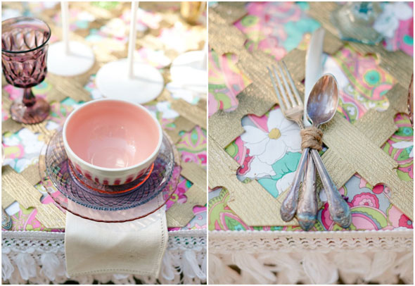
We pulled elements from this album cover to inspire a lot of our design from the shoot, including the table top. We wanted to emulate the look of the folding screen on the album, so I found an awesome fabric with bright, bold colors and a psychedelic pattern, and Melissa of Pow Wow Vintage Rentals created the super rad custom cut-out panel.
She took a sheet of plastic garden trellis, and used a dremel tool to make the notches that created the pattern we wanted. This would obviously take some skill and time, but I loved that she made something so special out of relatively cheap materials. Afterwards, she spray painted the whole thing a burnished gold.
When putting the table together, we laid down the fabric and attached it under the table edge. The edge of the table was adorned with two layers of white fringe trim, the panel was laid on top, and voila! You could also attach the fabric to the panel if you’re unable to attach to the table directly. Even before the flowers, or plates, or candle sticks were put down, we had a table top overflowing with visual interest.
Next is the dreamy cake set-up (on a transformed gallows of all places)!
The flowing fabric tied around the side beams was simply ripped into strips, and tied on. You could use any kind of fabric you want, it’s incredibly easy! Just cut a little starting point with your scissors to make the fabric rip more easily.
The platform was layered with loose pieces of fabric and white fur rugs. I love the texture it gives, and is a great way to temporarily cover up an area that may be less than pretty looking. Fabric remnants are probably the cheapest way to go about it, and they can be re-used for something else later since they don’t need to be cut. An assortment of rugs would also look awesome!
For the lanterns, I bought a few cheap lampshades in differing shapes/sizes, and found a fabric I wanted to cover them with. I simply cut out the fabric and laid it over the lanterns. I made sure there was enough fabric to tuck under the openings on the top and bottom of the shade. I started by hot gluing the fabric ends in the top opening of the lamp. Once they were secured, I started gluing the bottom ends up, making sure to go slowly and keep the fabric ends pulled taut to avoid creases in the fabric. Once it was all glued, I cut out the trim, and hot glued it around the bottom. Since the fabric I used was sheer, I had to cover the shades in two layers so it would be opaque enough. If you are using an opaque fabric, one layer should be perfect!
Lastly, the giant fringed fabric LOVE letters. These are pretty simple to make, but take a looooong time! I think the result is worth it though:)
I chose to use a gradient of colors that matched the custom fonts on our paper goods. This made it more complicated than making them all one color, but I love how they turned out. First, choose a font you like, type out the letters you want to use in the largest size you can, then print out(I had one large letter printed per page of paper). Take measurements of each part of the letter, than calculate those dimensions to the size you want your letters to end up. The ones I made were about 4 feet tall. Once you have the dimensions, draw the outline of your letters in pencil on large sheets of cardboard. I used a yard stick to make sure my lines were straight, then cut them out with an x-acto knife.
From there you need to figure out your fabric placement on the letters. Depending on how many different fabrics you are using, use a ruler to make marks of where you want each fabric to start and stop on the letters. I cut my fabric out one strip at a time, so I could measure it and be less wasteful since the letters will require different size strips in different parts. Once I had the strip cut out, I used fringe scissors to cut a fringed end. Start from the bottom of each letter going up, and glue the strips down with hot glue. I cut the strips a bit longer so I could glue them down and fold them over the sides. Make sure to overlap each strip a bit so that the cardboard doesn’t show through.Keep gluing until you are done!
I hope these instructions helped for those of you wanting to try some of these DIY projects! Next time, I will have step-by-step photos as a visual aid:)


