
So, it’s been awhile since I talked about our first remodeling project in the new house in this post, but I’ve had a lot of people ask me for an update, so here it is! I will start off by saying, I know these photos aren’t on par with the gorgeous images I usually feature on this blog by great photographers, but alas, I am a terrible photographer and snapped all of these on my iPhone.
Here is a little collage of some photos I used as inspiration going into the project…
Photos via DecorPad
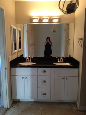
And here is what we started with, well part of it at least. I wish I had taken better before pictures, but I didn’t, so I will just try to describe what the space looked like before…
This is the only photo I have from before, a partial view of the master bath from the MLS listing photos. When we bought our house, the master bedroom was a fair size, but the bathroom was itty bitty and it just had a standard reach-in closet with sliding doors. That wasn’t going to cut it for us, because we really wanted to have a master suite that was spacious, relaxing, and a little bit luxe. To start, we took the space that housed the existing reach-in closet, as well as a linen closet in the hallway, and added that space to the bathroom. This allowed us to make the shower quite a bit larger and also add a makeup vanity. I REALLLLLLLLY wanted to put a tub in as well, but even with the newly improved space, it just wasn’t large enough.
Here is a shot after they had ripped the old tile flooring out, and it includes the horrible light fixture I couldn’t wait to get rid of. Also a photo of the newly framed shower stall. The toilet was in its own little area, but for some added privacy, we decided to add a pocket door. You can see the framing for that to the left of the shower.
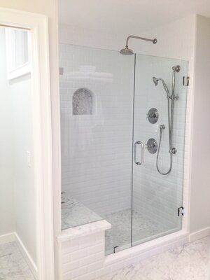
Here is an “in-progress” photo of the shower being tiled. We chose white beveled subway tiles for the walls, herringbone carrara tiles for the shower floor and the back of the niches. That unfinished seat you see was topped with a piece of a carrara slab we chose. The rest of the slab was used on the counter tops which you will see a bit later.
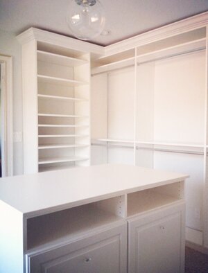
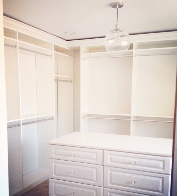
Now, to address the closet. Since we turned our existing closet into part of the new bathroom, we needed a new closet. Luckily there is a seriously gigantic bonus room next to the master (seriously, you could have fit 3 small bedrooms into it), so we broke through the wall and turned part of that bonus room into a new walk in closet for the master. Here is the new closet all framed out. I love that we were able to include a window in it!
Now to the finished bathroom + closet…
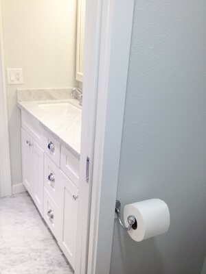
The sink vanity + closed pocket door.

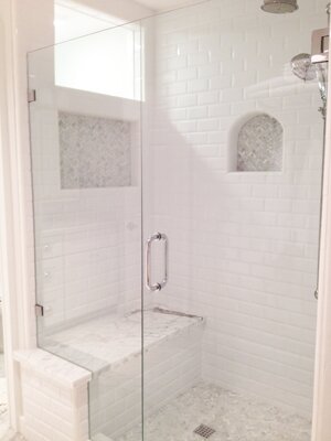
Since there is only one small window in the bathroom and we wanted to let maximum light in, we had a “window” put towards the top of the shower stall. They made a frame around it on the outer wall that matched the look of the door frames we used throughout the master suite.
View from inside the pocket door, looking out + view outside the open pocket door, looking in.
The view of the shower as you walk in the bathroom door. I really wanted to put a little linen cabinet into the bathroom, but we didn’t have enough space, so we opted for this train rack style towel storage. I love it!
Another view of the shower + a close up of the shower bench. The top of the bench came from my absolute favorite part of the carrara slab we chose. I looked at a ton in the stone yards before finally choosing this one. The dramatic veining is what won me over.
Now, to the closet…
Here is the sliding barn door we had installed. This is before the handle hardware was added. This has to be one of my favorite parts of the renovation!
The sliding barn door with handle hardware + one view of the customized closet organizer, complete with pull out hampers. Those hampers had me over the moon!
And another view of the closet organizer. I chose to change the standard hardware they offered out for some little crystal knobs I bought. I’m so glad I did!
There is also another view of the closet which includes the window, shoe storage and two tall linen cabinets- but somehow I didn’t take a picture from that angle. I’ll have to share that later:)
Currently we are working on re-doing the staircase, adding in a pantry under the new stairs, and FINALLY painting the main area of the house. I will do another post with that project once it’s finished.
Hope you enjoyed this (despite my bad photos, haha)!

You’re probably wondering where the heck I’ve been! Well, it’s one of those times where life got so crazy that there was barely time for breathing and sleeping, let alone anything else. I mentioned it before, but we recently bought our first home!
Well, we finally moved in! My husband is also in the process of moving his screen printing business into a giant new building (SO proud/excited!!!), so with all of that, I’m sure you can imagine what my days were like- Packing, packing, cleaning, packing, packing, breaking down into irrational tears, and more packing.
We are also doing some remodeling. The master bath got completely gutted and was expanded into the existing master bedroom closet. We built a new walk in closet which takes up a portion of the huge bonus room which is next to the master. We wanted to have all that done before we moved in…but that didn’t happen. Managing a remodel has been a day-to-day learning process. It’s full of frustration, things going wrong and delays, but it’s also super exciting to see it all come together!
Above are some of the inspiration photos I used for our new bathroom/closet. If you follow me on Instagram, you’ve probably seen a few progress pictures, but we still have at least a week until everything is finished up. We are living in the guest room until it’s finished, and I CAN’T WAIT to get into the master!!! I will do another post with more pictures once it’s done so you can see how my inspiration came to life.
Once we are done with the master suite remodel, we are moving on to redoing our staircase and adding a pantry underneath it. I have to say, I am finding it incredibly challenging and difficult to live and work from a home with workers in and out all day, and all the noises that go along with a remodel, but I am so psyched for the final outcome of it all!
So, I apologize for being MIA. I wanted to let you all know where I went, and also that I have some great new posts coming up for you soon that are filled to the brim with wedding goodness! Keep your eyes peeled:)

Today’s guest post is by my sweet friend Amber of Live It Out Photography…
I’m an head over heels for South African-based designer, Katie Thompson’s amazing collection of repurposed furniture. Not only would each piece look lovely in any home, but her furniture tells a story, which is always what draws me to flea markets. Not to mention you’re single-handedly shrinking our junk yards while radifying your digs. Yes, radifying.
“Katie never works within established stylistic boundaries. She creates an eclectic combination of styles, materials and finishes; this skill highlights her passion and her ability to find the intrinsic beauty and new, hidden purpose in the old, discarded items she chooses for her pieces.”
Like what you see? Check out Katie’s website for more of her creations.


The randomly selected winner for the Jules Smith Loves Only Knuckle Ring giveaway sponsored by the wonderful Designer Apparel.com is Richelle! Congratulations!!! Please send an email with your mailing info so we can get the ring out to you:)
Now, onto today’s post. I’m in awe of this gorgeous home! The distressed white floors, gorgeous chandelier and pops of blue have me smitten. Nothing provides me with more inspiration than beautiful photos of well decorated spaces!
I recently got a new-to-me desk that reminds me a bit to the one pictured below, and I am in the midst of painting it. Soon it will have its own chic creamy white coat. Now, if only the rest of my house looked like this one!
I’ll be heading up to the Bay Area for a quick trip this weekend to visit family. It will be so much fun to have a mini road trip adventure with my husband! What do you have planned?


This week is crazy busy, so posting will be a bit sparse. I didn’t want to leave you hanging though, so here are a few gems from my inspiration folder! I am a consummate girly girl and love all things pink, but I think using it selectively can make the biggest impact. These pretty pink accents have me absolutely smitten! They add so much character to these beautiful spaces.
I have some seriously amazing weddings coming your way soon, so stay tuned:)


Today we are moving away from weddings and moving into your home! My beautiful and talented friend (and bridesmaid) Kelsey shared some awesome tips for maximizing your space when your home isn’t exactly spacious. Here are a few of my faves:
Or in other words use vertical space as well as horizontal space. Don’t be afraid to put shelves up, hooks and hang things all around. Not only is it practical it’s a nice way to dress up your walls.
Last thing you want is that one giant couch or bed hogging up your entire space. Fact is if you’re going to live small you will also need to have smaller pieces.
Sometimes closets make good offices or places to put your bed.
How amazing are those beds in closets? Genius! To read more of Kelsey’s tips, head on over to her blog, House of Lamb.
Now, onto the part about me. I was passed the ‘Beautiful Blogger Award’ by two of the loveliest ladies I know, Aleah of The Good Life Events and Lydia of Ever Ours.
To start, I have to share 10 random facts about me:
{1} I am pretty obsessed with TV, I watch way too much. I wish I had Kristin Dos Santos‘ job on E!.
{2} I’m also obsessed with dogs! They are definitely in my top 5 list of things that make me happy. Though I love all dogs, I have an extra special place in my heart for Pit bulls and other bully breeds. I was active in rescue for awhile and have been a huge advocate for them ever since!
{3} During my teen years I attended boarding school and lived in both Utah and Montana.
{4} I have always loved reading, ever since I was a little girl. My life is always just a little bit better when I read every day.
{5} Though I am a huge lover of color, my wardrobe primarily consists of black, grey and more black.
{6} I daydream about the honeymoon my husband and I took to Fiji at least twice a day.
{7} I love traveling and REALLY want to go to Australia and New Zealand one day.
{8} I love flowers, but have a black thumb. When I was younger, I wanted to be a florist when I grew up. Secretly, I still do.
{9} I love Craigslist and check it way too often.
{10} I met my husband the day after I turned 20. I’m now 27 and the past 7 years have been the best of my life:)
Now, I get to pass this award along to 5 other bloggers. If you have already done this, I apologize. I just love you so much I had to pass it to you again!
There will be some serious wedding goodness coming your way tomorrow! Get ready:)


